This Cadastral Map is showing a vacation destination in Europe. This type of map is designed to show certain real property lines within a country. Often it will show land tenure and ownership, as it depics in this example. The maps are more comon in Europe than they are here in the states. This example is showing the entire plantation property (green) but then shows how it is divided into differnt sections based on the lines.
http://www.google.com/imgres?imgurl=http://www.lagrosterie.com/resources/_wsb_485x623_map2.jpg&imgrefurl=http://www.lagrosterie.com/3.html&usg=__yJ3BfBOYY0Eyfl6ZWbBI17sYUhc=&h=623&w=485&sz=42&hl=en&start=16&sig2=2uFQkFQUcoFuUFTUc33m_w&zoom=1&itbs=1&tbnid=21u_mXkHjU-RiM:&tbnh=136&tbnw=106&prev=/images%3Fq%3Dcadastral%2Bmap%26hl%3Den%26sa%3DG%26gbv%3D2%26ndsp%3D20%26tbm%3Disch&ei=ZqzaTZ76Mcmftwfn5q3oDg

Monday, May 23, 2011
Thematic Map
A Thematic Map displays the spatial distribution of an attribute that is relating to a specific theme. This example from 2007 shows us the spatial distribution of Governors and whether they were republican or democrat while they were in the office. This type of map is generally fairly easy to read and should make sense to almost all readers. From this map we can make a couple of assumptions; although the two different types of offices were spread out through the country, the republicans took the states farthers in the southeast, as well as the four states with the most electoral votes.
http://www.google.com/imgres?imgurl=http://www.gigawiz.com/images9/thematic1.jpg&imgrefurl=http://www.gigawiz.com/thematic.html&usg=__rgQCg8-0PZ0XLbJka4cZts099WE=&h=267&w=352&sz=33&hl=en&start=20&sig2=uRvzPixadrsAiczMOEQ1oA&zoom=1&itbs=1&tbnid=-s7cJs0nxUUviM:&tbnh=91&tbnw=120&prev=/search%3Fq%3Dthematic%2Bmaps%26hl%3Den%26gbv%3D2%26biw%3D1003%26bih%3D527%26tbm%3Disch&ei=rH7aTcK-GMajtgfsw_ToDg
http://www.google.com/imgres?imgurl=http://www.gigawiz.com/images9/thematic1.jpg&imgrefurl=http://www.gigawiz.com/thematic.html&usg=__rgQCg8-0PZ0XLbJka4cZts099WE=&h=267&w=352&sz=33&hl=en&start=20&sig2=uRvzPixadrsAiczMOEQ1oA&zoom=1&itbs=1&tbnid=-s7cJs0nxUUviM:&tbnh=91&tbnw=120&prev=/search%3Fq%3Dthematic%2Bmaps%26hl%3Den%26gbv%3D2%26biw%3D1003%26bih%3D527%26tbm%3Disch&ei=rH7aTcK-GMajtgfsw_ToDg
Topographic Map
A Topographic Map shows elevation above sea level. This type of map is particuarly handy for hikers that will be curious about the challenges of the trails in front of them. This will show them when the land is going to be steep and present more of a challenge. The most usefull characteristic on a topographic map is the contour lines. These lines can range from different intervals, based on how the map's key is established, but then the lines hold the same amount of elevation between each interval. For example, if each line represents a hundred feet, then a one who is looking at a grouping of a lot of closely put togther lines will know that this is going to be a steep climb. The closer lines are together on a map, the higher the elevation is in that area.
http://www.google.com/imgres?imgurl=http://images-mediawiki-sites.thefullwiki.org/04/1/3/8/93077923258524523.png&imgrefurl=http://www.thefullwiki.org/Topographic_maps&usg=__7rQVRSLVtrzseR_z0OH73mOxUkM=&h=300&w=300&sz=181&hl=en&start=45&sig2=BfeLyNX0lpnAgGvKyJw7Yg&zoom=1&itbs=1&tbnid=F16q6wy7bxnfFM:&tbnh=116&tbnw=116&prev=/search%3Fq%3Dtopographic%2Bmaps%26start%3D40%26hl%3Den%26sa%3DN%26gbv%3D2%26ndsp%3D20%26biw%3D1003%26bih%3D527%26tbm%3Disch&ei=IoLaTZ_3ItCTtwf648zoDg
http://www.google.com/imgres?imgurl=http://images-mediawiki-sites.thefullwiki.org/04/1/3/8/93077923258524523.png&imgrefurl=http://www.thefullwiki.org/Topographic_maps&usg=__7rQVRSLVtrzseR_z0OH73mOxUkM=&h=300&w=300&sz=181&hl=en&start=45&sig2=BfeLyNX0lpnAgGvKyJw7Yg&zoom=1&itbs=1&tbnid=F16q6wy7bxnfFM:&tbnh=116&tbnw=116&prev=/search%3Fq%3Dtopographic%2Bmaps%26start%3D40%26hl%3Den%26sa%3DN%26gbv%3D2%26ndsp%3D20%26biw%3D1003%26bih%3D527%26tbm%3Disch&ei=IoLaTZ_3ItCTtwf648zoDg
Tuesday, May 17, 2011
Planimetric Map
http://www.google.com/imgres?imgurl=http://egsc.usgs.gov/nimamaps/graphics/K341SIraqRefgra_th.jpg&imgrefurl=http://egsc.usgs.gov/nimamaps/topo.html&usg=__GmIY3bZKkCgLa1vfPQgKEaodjyY=&h=338&w=312&sz=51&hl=en&start=5&sig2=849D48DlxqAtHPVwA11ufg&zoom=1&itbs=1&tbnid=Q_2BiY2258epBM:&tbnh=119&tbnw=110&prev=/search%3Fq%3Dplanimetric%2Bmap%26hl%3Den%26sa%3DX%26rlz%3D1R2ADFA_enUS340%26biw%3D1003%26bih%3D527%26tbm%3Disch%26prmd%3Divns&ei=qcfSTbj0Ho2ztweDpfisCg
This Planimetric Map is a map that only shows the horizontal lines and is focussed on Iraq, although it does show parts of Turkey, Iran, Saudi Arabia, and Syria. This map is used by the United States government and is highly acurate. The conformality of the nations on this map appear to be fairly acurate since the shape of each, atleast by the naked eye, looks correct.
This Planimetric Map is a map that only shows the horizontal lines and is focussed on Iraq, although it does show parts of Turkey, Iran, Saudi Arabia, and Syria. This map is used by the United States government and is highly acurate. The conformality of the nations on this map appear to be fairly acurate since the shape of each, atleast by the naked eye, looks correct.
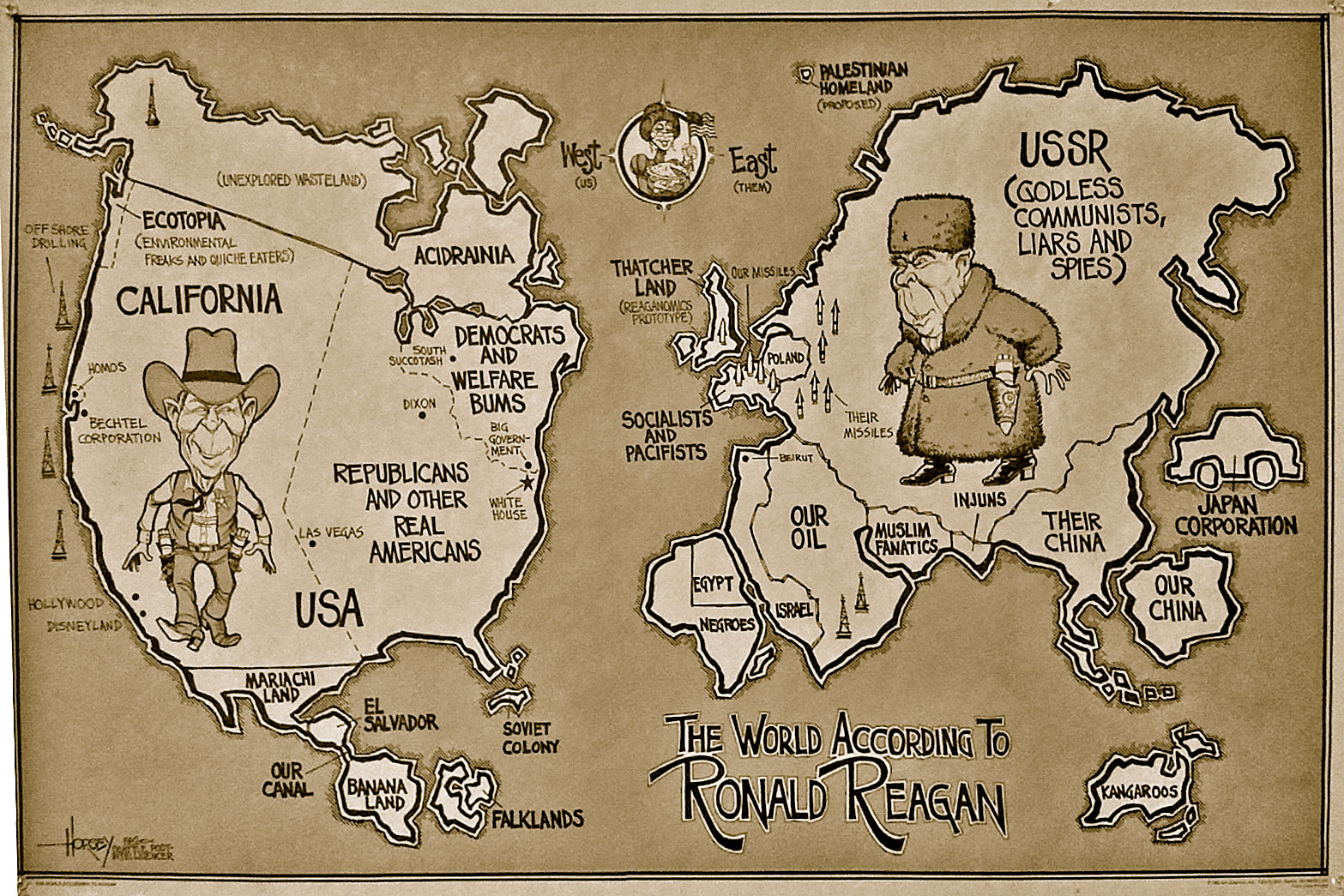
Ronal Reagan's mental map
http://kelsocartography.com/blog/wp-content/uploads/2009/09/the-world-according-to-ronald-reagan.jpg&imgrefurl=http://kelsocartography.com/blog/%3Ftag%3Dmental-map&usg=__HkLBE7U5-90LHV2SoMcSMatB7ps=&h=1045&w=1567&sz=567&hl=en&start=1&sig2=Fz0SymmNiWU0CMCJS57Wqg&zoom=1&itbs=1&tbnid=5hoviOkrSK9pFM:&tbnh=100&tbnw=150&prev=/search%3Fq%3Dmental%2Bmap%2Bof%2Bthe%2Bworld%26hl%3Den%26biw%3D1003%26bih%3D566%26gbv%3D2%26tbm%3Disch&ei=G7vSTdDfH5O5tgfnhsyeCg
This mental map is a portrait of how many people believe that President Ronald Reagan viewed the world. Some might get a laugh out of it and some might take offense to it, but this was Reagan's mental map. This map shows the views that the president had towards different regions of the world. It shows what President Reagan believed each part of the world was known for. Although some people might take offense to his beliefs the map does show a lot of truth to it. Problems with this map include all categories of correctness. The map is completely distorted and the projection is not even close to being acurate. The two major properties for a map, conformality and equivalence are completely distorted seeing that the true shape and true area are obviously not correct.
Subscribe to:
Comments (Atom)


