Monday, June 27, 2011

Star Plot


A Star Plot is a graphical method that is used for displaring various datums in a two dimensional way.  The center of the diagram has a central meeting point where the variables will radiate out from.
star plot


A Stem and Leaf Plot is a tool for displaying quantitative data in a graphical means.  This can make viewing for the reader much easier than having all the numbers thrown out to them.

Stem and lea plot


Boxes drawn either horizontal or vertical depicting graphical data are known as box plots.  This is a convient and effective manor of displaying relative information.  The example is comparing a machines ability to output energy.
machine box plot

Histogram


A Histogram is a a graphical representation of the distribution of data, shown as adjacent rectangles.  This example of sizes of fish could also be called a simple bar graph.

histogram of fish

A Tiangular Plot is a plot that has three different data variables.  When using an equilateral triangle it makes it easy for the viewer to compare the three categories of data.  This particular example shows us a comparison of three ultramafic rocks found in this area.
ultramafic rock triangular plot

Windrose

Image:Brosen windrose.svg

A Windrose, also known as a compass rose, is a figure on a map or chart that is used to display the orientation of the cardinal directions.  The windrose will usually point which way is North, and then the viewer can conclude which way the other directions are.

windrose

Climograph


A Climograph is a graph that shows the viwer the climate for a certain area.  This particular climograph uses a bar graph to show the climate for Honolulu, Hawaii.

Wednesday, June 22, 2011

Population Profile


A Population Profile is a graph that shows the viewer data about a particular population.  These are always used in the census, but can be used in smaller groupings as well.

population profile

Scatterplot

A Scatterplot is a diagram that uses coordinates to display data.  The coordinates consist of one value being on the X axis and another value being on the Y axis.  To read the data one would go to the point as follows; (X,Y).  The scatterplot here shows us how test scores compare to hours spent studying.

scatter plot

Tuesday, June 21, 2011

Index Value Plot

An Index Value Plot is a graph that makes the extremes stand out to the reader.  The extremes are shown by being on one side or the other of a relative line which is the "normal line" and considered to be an average.

index value plot

Accumulative Line Graph

An Accumulative Line Graph is a graph that is used when the author wants the viewer to be aware of the most up-to-date total that is possible.  Every new point includes the value from the last point so that it is cummulative and incorporates all the data.  As the reader can see here, each day is incorporated in the next as the cumulative mileage never goes downward.

Accumulative line graph

Bilateral Graph

A Bilateral Graph is a graph that compares two opposite sets of data.  It will show increases on one side of a zero line and decreases on the other.  This becomes a great tool to use when both negative and positive numbers need to be shown.

Bilateral Graph

Range Graded Proportional Circle Map

A Range Graded Proportional Circle Map is a map that uses circles based on their size to correlate directly to the quantity for that data given in the symbol key. As we see from the example, the ppm of zinc in the surrounding area.

range graded

Continuously Variable Proportional Circle Map

A Continuously Variable Proportional Circle Map has a lot in common with a proportional circle map, actually it is a proportional circle map, it just has more data involved to convey more information.  The circles can also be in proportion to the data rather than in proportion to the area.

continuous variable proportional circle map

Digital Orthophoto Quarter Quads

Digital Orthophoto Quater Quads are digital aerial images produced by the USGS.  The example here is a map of Florida, digitally redone by the US Geological Survey.

USGS DOQQ

Monday, June 20, 2011

Digital Elevation Model

A Digital Elevation Model is a three dimensional representation of a terrain's surface, digitally.  DEM's are often used for space models such as Earth, moons, or other planets, to show what their terrain looks like.  The example here shows us a digital elevation model of the terrain of Mt St Helens after the eruption in May of 1980.  You can see the entire top of the volcano was blown away from the blast.

mt st helens before and after

Digital Line Graph


A Digital Line Graph map is another feature that is incorporated with a USGS map.  These lines are present to represent topographic information. 

Digital Line Graph

Digital Raster Graphic

A Digital Raster Graphic map is a map that is turned into a digital image after it is scanned.   The map usually includes the original border, as we can see from the example. (the blue line)  These scanned images are taken from USGS maps.

DRG

Tuesday, June 14, 2011

Isopleth maps can be compared to choropleth maps.  They both depict a variable with a line that cannot be represented by a single point.  It is used to convey information across a large area.  This being said all the different types of isopleths such as, isobar maps, isotach maps, isohyet maps, etc are all also isopleth maps.  This particular example of both an Isopleth and Choropleth map is showing amounts of acid rain across the eastern half of the United States.

Isopleth of Acid Rain

Isopach


An Isopach map has lines that show the thickness of stratum, or soil and sedimentary rock.  This is very significant to professions such as drillers because they need to know what they are up against when drilling into the Earth.  In this example from New Zealand, the reader can see how much thicker the rock gets as you go away from the coast.  This map can also be a Choropleth map because of its use in shading as well as lines.
Isohyets are lines joining places of equal precipitation on a map.  These places therefore have the same amount of rainfall.  The example is showing Austrailia's rainfall.  This map is also a Chrorpleth map because along with the use of lines for precipitation, it also uses shading.

Isohyets

Isotachs

An Isotach is a line drawn on a map that has constant windspeed.  This is used for meteorologist.  These lines are shown often on radars to let people know what the wind directions are for a given area.  This map is showing fairly high wind speeds for the gulf and atlantic coast.  If i had to guess I would say this map was given to let people know of wind speeds from an incoming hurricane.

Isotachs

Isobar

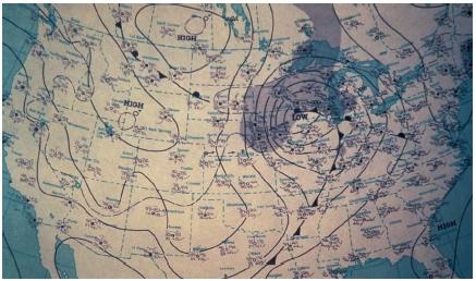
An Isobar is a line on a graph, chart, or map that has the same pressure.  These are lines drawn on a map to connect places with equal average atmospheric pressures.  In this example the reader can see where each part of the country is sharing the same level of pressure.  The midwest storm appears to be holding over the great lakes region, but it is affecting the entire United States as well as Canada and Mexico.

Isobar map

Thursday, June 9, 2011

LIDAR


LIDAR, Light Detection and Ranging, is a technology that uses a laser to measure distance to and other properties about a certain target.  The remote sensing technology uses a laser to light up the target.  This is often used in archaeology, geography, geology, geomorphology, seismology, forestry, and remote sensing.

http://www.google.com/imgres?imgurl=http://forsys.cfr.washington.edu/JFSP06/images/lidar_schematic.jpg&imgrefurl=http://forsys.cfr.washington.edu/JFSP06/lidar_technology.htm&usg=__oZFLvXNvl2EFdkZ60eJ7bgcReQw=&h=433&w=400&sz=16&hl=en&start=2&sig2=8XHOKB1S6SG2nmJBqO9zMg&zoom=1&um=1&itbs=1&tbnid=3ZaeSx97GfpEXM:&tbnh=126&tbnw=116&prev=/images%3Fq%3DLIDAR%26um%3D1%26hl%3Den%26rlz%3D1T4ADFA_enUS340US340%26tbm%3Disch&ei=1vnwTdn7DpCFtgfDwLCdAw

Doppler Radar


Doppler Radar is a special type of radar that uses the doppler effect to send electrical waves to the target and then have them bounce back to show the size and or shape of the intended target.  It is most often used in weather for checking day to day cloud cover, or as we see here, to check the status of a huge storm such as Hurrican Katrina.

http://www.google.com/imgres?imgurl=http://www.katrina.noaa.gov/images/katrina-08-28-2005.jpg&imgrefurl=http://addins.wrex.com/blogs/weather/2007/08&usg=__JS6wWQORIecoXJ4KbXdRatgue4c=&h=1200&w=1920&sz=933&hl=en&start=1&sig2=15PepetJj32A1RcCxb_Q2g&zoom=1&um=1&itbs=1&tbnid=IzVw7n7fcGRcYM:&tbnh=94&tbnw=150&prev=/search%3Fq%3Ddoppler%2Bradar%2Bkatrina%26um%3D1%26hl%3Den%26rlz%3D1T4ADFA_enUS340US340%26tbm%3Disch&ei=S-fwTbbDH4G3tgek1-SWAw

Black and White aerial photo


This Black and White Aerial Photo was taken from an aircraft high above Lost Island Lake.  This can be used as a map because it vividly shows the outline and surroundings of the lake itself.  Black and white aerial photos help alot when dealing with water because they will make the comparison very obvious.

http://www.google.com/imgres?imgurl=http://www.lakemapper.com/Lost%2520Island/lost%2520island%2520lake%25201930s%2520aerial%2520photo%2520map.jpg&imgrefurl=http://www.lakemapper.com/Lost%2520Island/Lost%2520Island%2520Lake%2520Homepage.html&usg=__UjzWq-3o_RhdN73RHhbc_9FCvdA=&h=317&w=396&sz=104&hl=en&start=21&sig2=0RxRRhTiB1QNm_KEXNdwzg&zoom=1&itbs=1&tbnid=QmShj0YLLMuIKM:&tbnh=99&tbnw=124&prev=/search%3Fq%3Dblack%2Band%2Bwhite%2Baerial%2Bmap%26start%3D20%26hl%3Den%26sa%3DN%26biw%3D1003%26bih%3D566%26gbv%3D2%26ndsp%3D20%26tbm%3Disch&ei=D-PwTelXyKK2B-WEhJwD

Infrared aerial


This Infrared Aerial photo was taken in Washington state.  The Infrared camera picked up the aquatic vegetation (yellow area) and made it obvious for the viewer to see it.  This was useful in a research the state was doing on oyster beds and quatic vegetation.  The red lines are marking off different oyster beds.

http://www.google.com/imgres?imgurl=http://www.ars.usda.gov/is/graphics/photos/may08/d1113-1i.jpg&imgrefurl=http://www.ars.usda.gov/is/AR/archive/may08/oyster0508.htm%3Fpf%3D1&usg=__fmhrqRMptmzw4wYprjgpDh59uFo=&h=187&w=252&sz=92&hl=en&start=17&sig2=tpApBJ3OBw6EnoYzlpfqfA&zoom=1&um=1&itbs=1&tbnid=xHYL9faUnbylqM:&tbnh=82&tbnw=111&prev=/search%3Fq%3Dinfrared%2Baerial%2Bmaps%26um%3D1%26hl%3Den%26sa%3DN%26biw%3D1003%26bih%3D566%26rlz%3D1R2ADFA_enUS340%26tbm%3Disch&ei=etnwTdmNIpOztwfYlKyUAw

Wednesday, June 8, 2011

Cartographic Animation


Cartographic Animation, or animated map, is a map that will have some type of video or other movement involved in it.  The animation can be to demonstrate something, or to convey a current situation.  A prime example of a cartographic animation is a doplar radar.  The animated map shows the weather coming through in a doplar radar.  This example is showing the United States population boom from 1910 to 2000.  Each white dot represents 10,000 ctitizens.

Thursday, June 2, 2011

Statistical Map

A Statistical Map shows certain statistics for certain regions.  The example here shows international connectivity through internet between countries.
http://www.google.com/imgres?imgurl=http://personalpages.manchester.ac.uk/staff/m.dodge/cybergeography/atlas/landweber_version_16.gif&imgrefurl=http://personalpages.manchester.ac.uk/staff/m.dodge/cybergeography/atlas/census.html&usg=__7Q_J2rHYT0rdoNo1d50AGS3tuUU=&h=503&w=719&sz=15&hl=en&start=15&sig2=VjiUhzXzQ7dGZvjdUrhAtA&zoom=1&um=1&itbs=1&tbnid=8zkjRi3C-jMGjM:&tbnh=98&tbnw=140&prev=/images%3Fq%3Dstatistical%2Bmap%26um%3D1%26hl%3Den%26rlz%3D1R2ADFA_enUS340%26tbm%3Disch&ei=O93nTeHyNYr40gGiz7iOCg

Cartogram

A Cartogram map is a map in which some form of the map is distorted in order to convey information.  The best learning tool I had for this is a cartogram area map made by a computer of the United States for population.  The reader can make out it is a map of the U.S. if they know what they are looking at but not if they are just shown the picture.  The key tells the reader the map shows distorted view based on the country's population.  Another example, and the one I used here, was a depiction of votes for the 2008 presidential election.  This could also be a Choropleth Map because the states are shaded and they are also proportioned based on their electoral votes.
http://www.google.com/imgres?imgurl=http://www-personal.umich.edu/~mejn/election/2008/statepopredblue1024.png&imgrefurl=http://www-personal.umich.edu/~mejn/election/&usg=__6uLfv91XLf7tIEGcvB0CRkU_1RU=&h=730&w=1024&sz=167&hl=en&start=1&sig2=i5M2qQ9qwTYmQeAxwgXbFA&zoom=1&um=1&itbs=1&tbnid=AUFJ2Xh8xM31KM:&tbnh=107&tbnw=150&prev=/search%3Fq%3Dpresidential%2Belection%2B2008%2Bcartogram%2Bmap%26um%3D1%26hl%3Den%26sa%3DN%26biw%3D1003%26bih%3D566%26rlz%3D1R2ADFA_enUS340%26tbm%3Disch&ei=59rnTY7HFYKutwfbronPCg

Flow Map

A Flow Map shows the movement of people, information, or objects.  A prime example is a flow map of migration, but there are unlimited possibilities.  The example I am using is a flow map of telecommunications in the Europe region.  It shows where the most telecommunications are going in and coming out of.  This map is also a Proportional Circle map because it shows each country's total usage in proportional circles to one another.
http://www.google.com/imgres?imgurl=http://www.mundi.net/maps/maps_014/august2000_small.gif&imgrefurl=http://www.mundi.net/maps/maps_014/&usg=___OdXBxbO9Aa7Y92gURsGA3AC2zk=&h=363&w=400&sz=16&hl=en&start=3&sig2=peYGxCuq13pAwARiJUbg9Q&zoom=1&itbs=1&tbnid=Z1kQB12E-xPQyM:&tbnh=113&tbnw=124&prev=/images%3Fq%3Dflow%2Bmap%26hl%3Den%26gbv%3D2%26ndsp%3D20%26tbm%3Disch&ei=99TnTezXCdKUtwfRpInKCg

Isoline Map

An Isoline Map is a map with continuous lines that are conected from dots which represent the data that is trying to be portrayed.  The lines often times represent contour lines, but they can also represent many other things such as climate, boundaries, and in this case, rainfall.  The lines in this map of New York represent different inches of rainfall for each area inside the lines.
http://www.google.com/imgres?imgurl=http://regentsprep.org/regents/earthsci/graphics/102A_9-10.gif&imgrefurl=http://regentsprep.org/regents/core/questions/questions.cfm%3FCourse%3DESCI%26TopicCode%3D07&usg=__ENm2lnfmW44e20_Z_kpZt9ApUjo=&h=390&w=500&sz=10&hl=en&start=9&sig2=MUxaUNWcWjY_Ox-Qelf2sw&zoom=1&itbs=1&tbnid=u0wjwDrUzahu8M:&tbnh=101&tbnw=130&prev=/images%3Fq%3Disoline%2Bmap%26hl%3Den%26gbv%3D2%26ndsp%3D20%26tbm%3Disch&ei=WcvnTdm2IIKitge115W4Cg

Proportional Circle Map

This Proportional Circle Map shows the percentage of homes that were built before 1940 in the westeren half of the United States.  Proportional Circle maps show relative information by showing circles that represent data that are proportional to each other.  Thus meaning, the higher the percentage of homes the bigger the circle; whereas the lower the percentage of homes built before 1940 in each particular state, the smaller the circle.
http://www.google.com/imgres?imgurl=http://www.neiu.edu/~tpoconno/geography/377/ProportionalCircle.jpg&imgrefurl=http://www.neiu.edu/~tpoconno/geography/377/377home.htm&usg=__iKXfw9xr0F7VgZGV7JE_0CJ1cIQ=&h=985&w=1010&sz=318&hl=en&start=41&sig2=fviibP5uVwlE4Z_jsvc0vQ&zoom=1&itbs=1&tbnid=PMft0HMCeGDbdM:&tbnh=146&tbnw=150&prev=/images%3Fq%3Dproportional%2Bcircle%2Bmap%26start%3D40%26hl%3Den%26sa%3DN%26gbv%3D2%26ndsp%3D20%26tbm%3Disch&ei=FcnnTab4O8OBtgffit3WCg

Choropleth Map

A Choropleth Map is a map that has ceretain areas or regions shaded in with a particular color that is proportional to the entire population being studied.  For example age/population density or presidential election/voter turnout.  These maps help distinguish more than just one fact by viewing one key.  For example, after viewing the key for this particular presidential election map, you will then know by glancing  at any state: who the state elected as president, how much the margin of victory was(aproximately), and aproximately what the voter turnout was.
http://www.google.com/imgres?imgurl=http://upload.wikimedia.org/wikipedia/commons/thumb/c/ca/2004US_election_map.svg/280px-2004US_election_map.svg.png&imgrefurl=http://en.wikipedia.org/wiki/Choropleth_map&usg=__QHjW4fPQSS0pCZTvtELVWnXiwfg=&h=193&w=280&sz=29&hl=en&start=18&sig2=d2QhPZ8JF89hfQY3d_EQfw&zoom=1&itbs=1&tbnid=-YHYtTWD_LXpAM:&tbnh=79&tbnw=114&prev=/images%3Fq%3Dchoropleth%2Bmap%26hl%3Den%26gbv%3D2%26ndsp%3D20%26tbm%3Disch&ei=g8bnTePaDsuutwfBvZXaCg

Dot Distribution Map

This Dot Distribution Map represents the world's population.  A dot distribution map shows concentrations of certain information for certain areas.  As we can see from the above, we know where the most heavily populated regions of the world are.  The map shows that we are actually in one right now, from a world perspective.http://www.google.com/imgres?imgurl=http://www.bbc.co.uk/scotland/learning/bitesize/standard/geography/images/g155.gif&imgrefurl=http://www.bbc.co.uk/scotland/learning/bitesize/standard/geography/population/distribution_density_rev1.shtml&usg=__KnCTkXkjPsmKf6txtQq-sSj1adk=&h=290&w=546&sz=44&hl=en&start=39&sig2=5ibew_Z_ceSN9VxDUP0mmg&zoom=1&itbs=1&tbnid=dB7tLkHH1BsN7M:&tbnh=71&tbnw=133&prev=/images%3Fq%3Ddot%2Bdistribution%2Bmap%26start%3D20%26hl%3Den%26sa%3DN%26gbv%3D2%26ndsp%3D20%26tbm%3Disch&ei=0bDnTabUKJCltwf7k63bCg

Propaganda Map

This Propaganda Map shows what the world thinks of Germany after World War I and the Treaty of Versailles.  It depicts Nazi propaganda to show that the world is against them.  Nazi propaganda became very popular and was their main ingredient to collect followers.  Propaganda uses pictures and sayings to promote the authors beliefs.http://www.google.com/imgres?imgurl=https://www.msu.edu/~wandless/GermanMilitary.jpg&imgrefurl=http://www.msu.edu/~wandless/NaziPropaganda1.html&usg=__pYhmGAAE2Slsvcg36qE81iNDhWg=&h=422&w=636&sz=78&hl=en&start=17&sig2=HsKT3Mf-PX7qL-zRy8sKWQ&zoom=1&itbs=1&tbnid=pDi15IMbUOjDLM:&tbnh=91&tbnw=137&prev=/images%3Fq%3Dpropaganda%2Bmap%26hl%3Den%26gbv%3D2%26tbm%3Disch&ei=Zq3nTaC9FYygtwf_8a29Cg

Hypsometric Map

A hypsometric map focuses on elevation.  It shows difference in elevation by different bands of color- each color scheme will represent a different elevation.  This particular map shows that the middle of the country is the flattest region where as the borders are elevated.  This map uses a color scheme that shows the lighter the color the flatter the region.http://www.google.com/imgres?imgurl=http://www.acsu.buffalo.edu/~dbertuca/maps/cat/hypsometric-tints-map.jpg&imgrefurl=http://www.acsu.buffalo.edu/~dbertuca/maps/cat/map-portion-images.html&usg=__JmWK2iHT4nFgwUyJ5lfhezRiK80=&h=365&w=471&sz=101&hl=en&start=5&sig2=D8FMQQiHpVfvC01EeQgTpg&zoom=1&itbs=1&tbnid=oKmhFAkkwXXI7M:&tbnh=100&tbnw=129&prev=/search%3Fq%3Dhypsometric%2Bmap%26hl%3Den%26biw%3D1003%26bih%3D566%26gbv%3D2%26tbm%3Disch&ei=JarnTc3nG8e5tgfj25zbCg

PLSS Map


A PLSS Map was the first mathematically designed system and nationaly conducted cadastral survey in any modern county.  This map is used in the United States to identify land, especially for titles and deeds of undeveloped rural land.  As we can see in this particular example, most states are divided into state land.