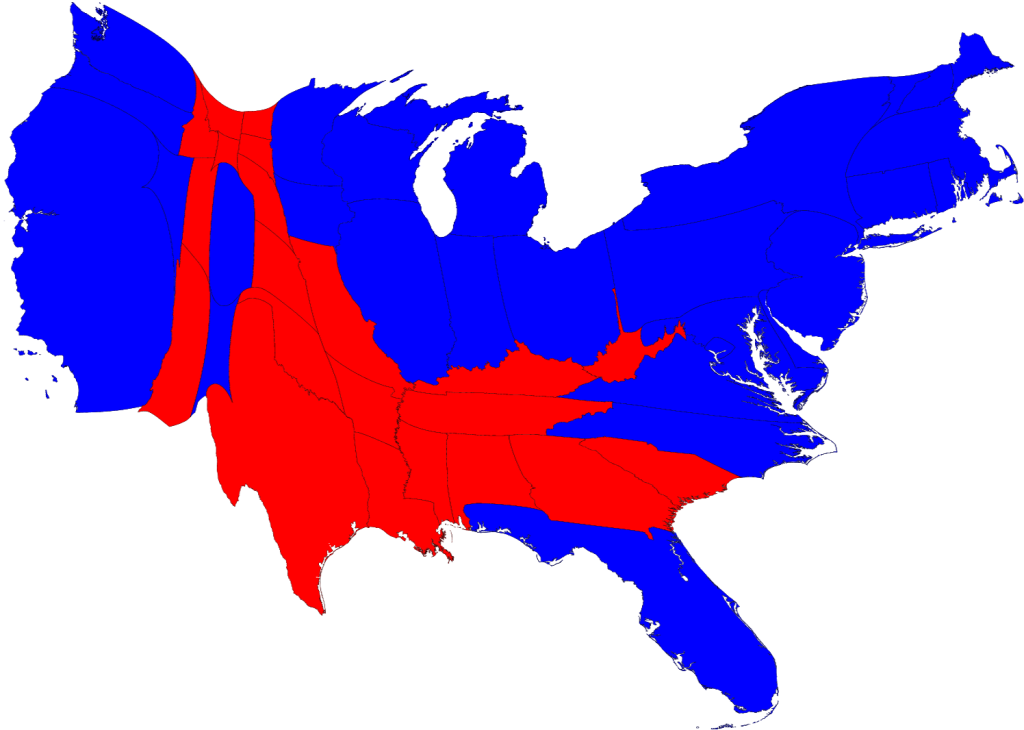
A Cartogram map is a map in which some form of the map is distorted in order to convey information. The best learning tool I had for this is a cartogram area map made by a computer of the United States for population. The reader can make out it is a map of the U.S. if they know what they are looking at but not if they are just shown the picture. The key tells the reader the map shows distorted view based on the country's population. Another example, and the one I used here, was a depiction of votes for the 2008 presidential election. This could also be a Choropleth Map because the states are shaded and they are also proportioned based on their electoral votes.
http://www.google.com/imgres?imgurl=http://www-personal.umich.edu/~mejn/election/2008/statepopredblue1024.png&imgrefurl=http://www-personal.umich.edu/~mejn/election/&usg=__6uLfv91XLf7tIEGcvB0CRkU_1RU=&h=730&w=1024&sz=167&hl=en&start=1&sig2=i5M2qQ9qwTYmQeAxwgXbFA&zoom=1&um=1&itbs=1&tbnid=AUFJ2Xh8xM31KM:&tbnh=107&tbnw=150&prev=/search%3Fq%3Dpresidential%2Belection%2B2008%2Bcartogram%2Bmap%26um%3D1%26hl%3Den%26sa%3DN%26biw%3D1003%26bih%3D566%26rlz%3D1R2ADFA_enUS340%26tbm%3Disch&ei=59rnTY7HFYKutwfbronPCg

No comments:
Post a Comment