Seay Maps
Thursday, June 2, 2011
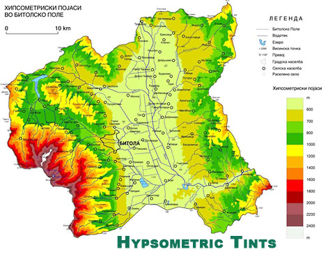
Hypsometric Map
A hypsometric map focuses on elevation. It shows difference in elevation by different bands of color- each color scheme will represent a different elevation. This particular map shows that the middle of the country is the flattest region where as the borders are elevated. This map uses a color scheme that shows the lighter the color the flatter the region.
http://www.google.com/imgres?imgurl=http://www.acsu.buffalo.edu/~dbertuca/maps/cat/hypsometric-tints-map.jpg&imgrefurl=http://www.acsu.buffalo.edu/~dbertuca/maps/cat/map-portion-images.html&usg=__JmWK2iHT4nFgwUyJ5lfhezRiK80=&h=365&w=471&sz=101&hl=en&start=5&sig2=D8FMQQiHpVfvC01EeQgTpg&zoom=1&itbs=1&tbnid=oKmhFAkkwXXI7M:&tbnh=100&tbnw=129&prev=/search%3Fq%3Dhypsometric%2Bmap%26hl%3Den%26biw%3D1003%26bih%3D566%26gbv%3D2%26tbm%3Disch&ei=JarnTc3nG8e5tgfj25zbCg
No comments:
Post a Comment
Newer Post
Older Post
Home
Subscribe to:
Post Comments (Atom)

No comments:
Post a Comment